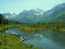
Just a quick thought: if you found a summer image of one of the nearby Boston public spaces ( with green) to contrast the bleak setting of the site, you would have another argument in your quest for green.
The circulation diagrams still clarifications in terms of "this is bad - this is good" ef
I think the black boards are quite effective and they really make your graphics pop. If you continue that them you'll have to be very mindful of lineweights on your plans and sections to really help them read, but so far, it looks excellent.
A couple comments off the top of my head:
I would love to see the photo images cleaned up a little bit, particularly the collage. I think if you collapse it and crop it, then resize it to have all of your images the same height vertically, it would be a little less distracting.
Second - the third map on the page seems to imply just the opposite of what you are conveying and what we know is true. There are some large open spaces on that diagram that, to me, read as if they would be plazas or green spaces. I know that isn't what you are trying to convey, so maybe work on what exactly that diagram means to your overall design.
Otherwise it looks great. Can't wait to see you advance the design and I really look forward to seeing some more of your sketches - they are quite wonderful.

2 comments:
Curtis,
Just a quick thought: if you found a summer image of one of the nearby Boston public spaces ( with green) to contrast the bleak setting of the site, you would have another argument in your quest for green.
The circulation diagrams still clarifications in terms of "this is bad - this is good"
ef
Curtis,
I think the black boards are quite effective and they really make your graphics pop. If you continue that them you'll have to be very mindful of lineweights on your plans and sections to really help them read, but so far, it looks excellent.
A couple comments off the top of my head:
I would love to see the photo images cleaned up a little bit, particularly the collage. I think if you collapse it and crop it, then resize it to have all of your images the same height vertically, it would be a little less distracting.
Second - the third map on the page seems to imply just the opposite of what you are conveying and what we know is true. There are some large open spaces on that diagram that, to me, read as if they would be plazas or green spaces. I know that isn't what you are trying to convey, so maybe work on what exactly that diagram means to your overall design.
Otherwise it looks great. Can't wait to see you advance the design and I really look forward to seeing some more of your sketches - they are quite wonderful.
Post a Comment